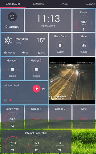
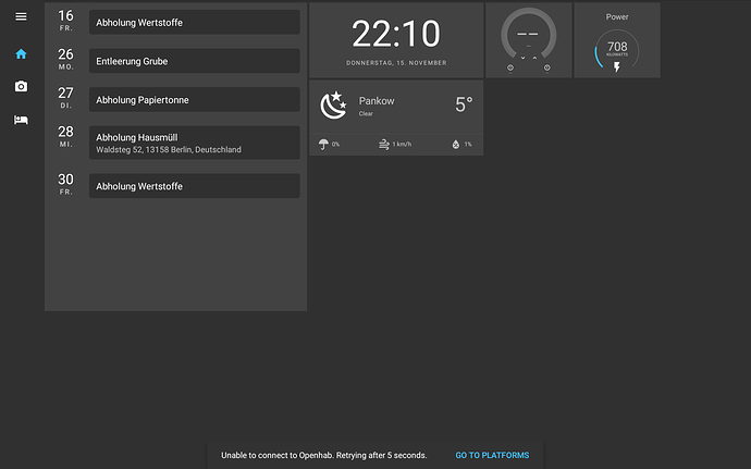
This is a screenshot of what my main dashboard looks like in the old Rotini legacy app…
I’ll use this topic to keep a track of my journey to get something similar in the HomeHabit app…
UPDATE
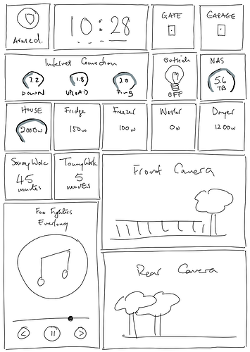
A bit of trial and error and I’ve figured out the best layout for my LG tablet mounted on the wall is going to be 5 columns by 7 rows… And a quick mockup in OneNote for me to aim for…
UPDATE
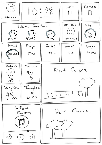
Looks like the media widget doesn’t look so good in my testing so made it a bit smaller and gave me room for a couple more widgets…
UPDATE : 20th Oct 2018
Okay have wasted enough time on this today 
Gonna venture outside for a while…
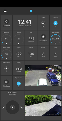
I’ve made some good progress quite quickly which is awesome. Just a few issues I need to try resolve…
- Ideally Scene widgets should show the label at the top when the sty;e is “mode”.
- My decimal numbers are too big and about the same size as the whole numbers.
- Webcam images would look better “stretched”
- Being able to set a widget as “read only” would be great
- Media widget needs support for cover art from OpenHAB image item.
- Media widget needs a couple more controls like volume and power.
- Use Font Awesome for extra custom icons?
This is what I have it looking like so far.
UPDATE : 1st Dec 2018
Been looking at this again today to see if any updates let me improve my new dashboard…
- Ideally Scene widgets should show the label at the top when the sty;e is “mode”.
- My decimal numbers are too big and about the same size as the whole numbers.
- DONE! : Webcam images would look better “stretched”
- Being able to set a widget as “read only” would be great
- Media widget needs support for cover art from OpenHAB image item.
- Media widget needs a couple more controls like volume and power.
- Play button on media widget doesn’t seem to work
- Prev/Next buttons on media widget do nothing
- Use Font Awesome for extra custom icons?
- Decimal values in widgets too big
- Setting up a garage/gate widget that works for me is still overly complicated involving extra hidden items and rules…
