
8.0 release will have Custom Widgets feature available in HomeHabit Labs.
Warnings
 Please make configuration backup before enabling this feature.
This is an extremely experimental feature. It might significantly change in the future, have breaking changes in-between releases, or be discontinued.
It might also have a performance impact on dashboard loading time, depending on capabilities of the device.
What are Custom Widgets?
Custom widgets allow rendering a fully custom widget within existing dashboard. Custom widgets can show and act on any data available from the connected platforms.
These widgets are written in JavaScript as Web Components, using Remote Admin (see below).
What is Remote Admin?
Remote Admin is the new web interface that allows to configure the app using any browser. It is a replacement for Remote Config editor.
Note: Remote Admin URL is different, please check Settings for the correct URL.
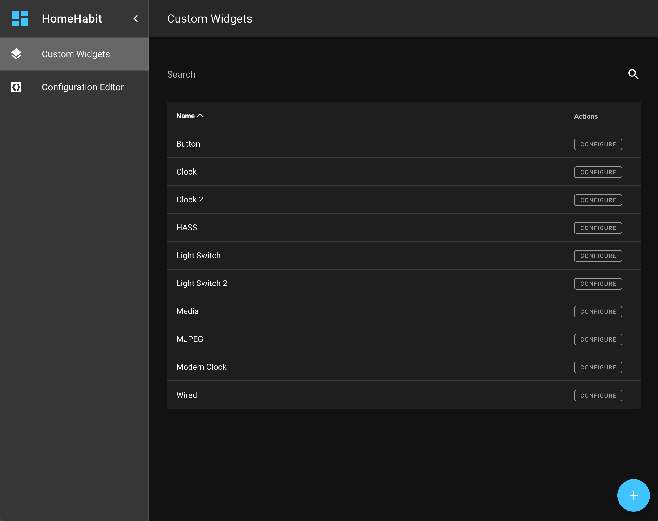
How to enable these features?
- Go to Settings > HomeHabit Labs
- Enable both Custom widgets and Remote admin features
- Restart the application
Availability
- 8.0 build 4936 or newer
- Android 5.0+ (currently will not work on Amazon devices)
How to create custom widgets?
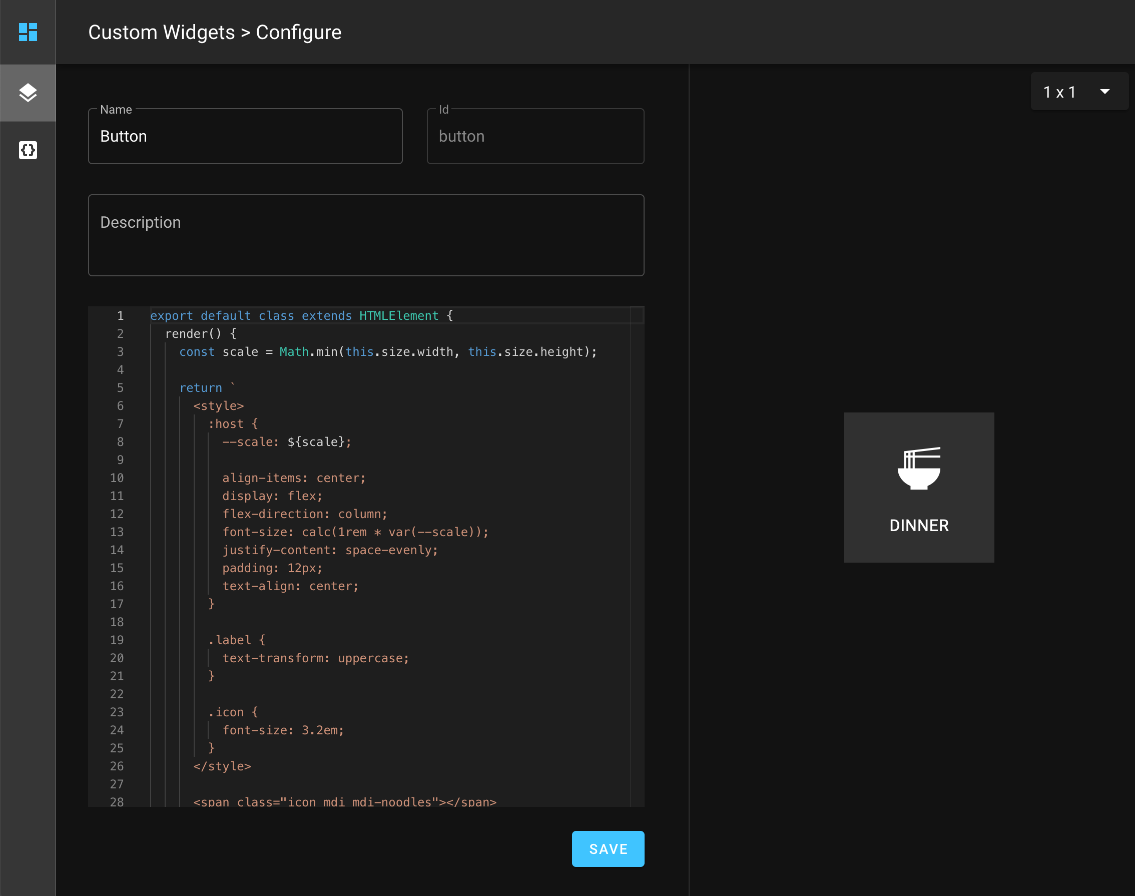
Open Remote Admin, and navigate to Custom Widgets section.
There you can create new custom widgets (see examples below).
After custom widget is created, it needs to be added to a dashboard. When editing dashboard in the app, there will be a new widget type: custom, which will have all created custom widgets available.
Currently, it is not possible to add configurable properties to a custom widget. This is planned as a future enhancement.
Custom widget structure
Widget is defined using a class that extends from HTMLElement.
render() method is required and should return HTML widget content. render() method will be called each time widget needs to be updated.
export default class extends HTMLElement {
  render() {
    return ``;
  }
}
Actionable widgets
Add onAction() method to Web Component. It will be called on each tap (currently, only whole widget tap is supported).
onAction() {
  const currentState = this.state['hass.light#switch.state'];

  // toggle
  this.state['hass.light#switch.state'] = !currentState;
}
Load external CSS
Add static styles() array property to Web Component.
For example, here how to load MDC icons:
static get styles() {
  return [
    'https://cdn.materialdesignicons.com/5.4.55/css/materialdesignicons.min.css',
  ];
}
Platform data
Platform items data can be retrieved within custom widget using this.state, e.g.:
const lightState = this.state['hass.light#switch.state'];
Changing state of an item is as simple as assigning to value to this.state property, e.g.:
this.state['hass.light#switch.state'] = false;
Screenshots
Remote Admin
Custom widget editor
Custom widget examples
Note: item bindings are just examples and will need to be updated to point to actual items within your setup
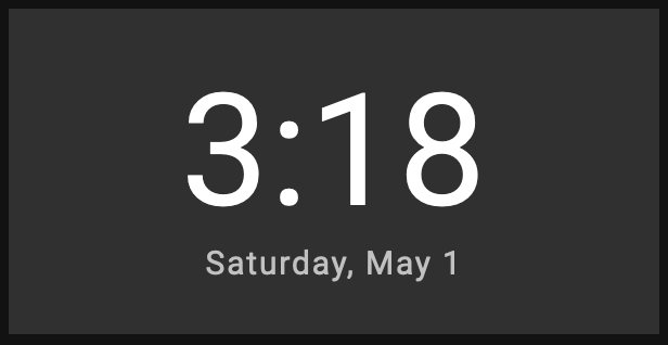
Clock
export default class extends HTMLElement {
  render() {
    const now = this.state['time.now#timestamp'];
    const horizontal = this.size.width > this.size.height;
    const scale = horizontal ? this.size.height : Math.min(this.size.width, this.size.height) / 2;

    return `
      <style>
        :host {
          --scale: ${scale};

          align-items: center;
          display: flex;
          flex-direction: column;
          font-size: calc(1rem * var(--scale));
          justify-content: center;
          text-align: center;
        }

        .time {
          font-size: ${horizontal ? '4.5em' : '6.5em'};
          letter-spacing: 0.009375em;
        }

        .date {
          font-size: ${horizontal ? '0.9375em' : '1.25em'};
          letter-spacing: 0.06em;
        }
      </style>

      <time-formatted hour="numeric" minute="numeric" class="time" datetime="${now}"></time-formatted>
      <time-formatted weekday="long" month="long" day="numeric" class="date" part="color-text-secondary" datetime="${now}"></time-formatted>
    `;
  }
}
Flip Clock
export default class extends HTMLElement {
  render() {
    const scale = Math.min(this.size.width, this.size.height);

    const currentHour = this.state['time.now#hour'];
    const currentMinute = this.state['time.now#minute'];
    const previousHour = (12 + (currentHour - 1)) % 12;
    const previousMinute = (60 + (currentMinute - 1)) % 60;

    const currentHourPadded = ('0' + currentHour).slice(-2);
    const currentMinutePadded = ('0' + currentMinute).slice(-2);
    const previousHourPadded = ('0' + previousHour).slice(-2);
    const previousMinutePadded = ('0' + previousMinute).slice(-2);

    const hourChanged = this.hour != undefined && currentHour != this.hour;
    const minuteChanged = this.minute != undefined && currentMinute != this.minute;

    this.hour = currentHour;
    this.minute = currentMinute;

    return `
      <style>
        :host {
          --animation-duration-bottom: 0.6s;
          --animation-duration-top: 0.3s;
          --background-bottom: #303030;
          --background-top: #212121;
          --border-radius: 0.15em;
          --scale: ${scale};
          --text-bottom: #fff;
          --text-top: #ccc;

          align-items: center;
          display: flex;
          flex-direction: column;
          font-size: calc(3.2rem * var(--scale));
          font-weight: 500;
          justify-content: center;
          text-align: center;
        }

        :host *,
        :host *:before,
        :host *:after {
          box-sizing: border-box;
        }

        .flip-clock {
          margin: 20px auto;
          perspective: 400px;
          text-align: center;
        }

        .flip-clock__piece {
          display: inline-block;
          margin: 0 5px;
        }

        .card {
          display: block;
          line-height: 0.95;
          padding-bottom: 0.72em;
          position: relative;
        }

        .card__top,
        .card__bottom,
        .card__back::before,
        .card__back::after {
          backface-visiblity: hidden;
          background: var(--background-top);
          border-radius: var(--border-radius) var(--border-radius) 0 0;
          color: var(--text-top);
          display: block;
          height: 0.72em;
          padding: 0.25em 0.25em;
          transform: translateZ(0);
          transform-style: preserve-3d;
          width: 1.8em;
        }

        .card__bottom {
          background: var(--background-bottom);
          border-radius: 0 0 var(--border-radius) var(--border-radius);
          border-top: solid 1px #000;
          color: var(--text-bottom);
          left: 0;
          overflow: hidden;
          position: absolute;
          top: 50%;
        }

        .card__bottom::after {
          display: block;
          margin-top: -0.72em;
        }

        .card__back::before,
        .card__bottom::after {
          content: attr(data-value);
        }

        .card__back {
          height: 100%;
          left: 0%;
          position: absolute;
          top: 0;
        }

        .card__back::before {
          overflow: hidden;
          position: relative;
          z-index: -1;
        }

        .flip .card__back::before {
          animation: flipTop cubic-bezier(0.37, 0.01, 0.94, 0.35);
          animation-duration: var(--animation-duration-top);
          animation-fill-mode: both;
          transform-origin: center bottom;
        }

        .flip .card__back .card__bottom {
          animation: flipBottom cubic-bezier(0.15, 0.45, 0.28, 1);
          animation-duration: var(--animation-duration-bottom);
          animation-fill-mode: both;
          transform-origin: center top;
        }

        @keyframes flipTop {
          0% {
            transform: rotateX(0deg);
            z-index: 2;
          }
          0%, 99% {
            opacity: 0.99;
          }
          100% {
            opacity: 0;
            transform: rotateX(-90deg);
          }
        }

        @keyframes flipBottom {
          0%, 50% {
            opacity: 0;
            transform: rotateX(90deg);
            z-index: -1;
          }
          51% {
            opacity: 0.99;
          }
          100% {
            opacity: 0.99;
            transform: rotateX(0deg);
            z-index: 5;
          }
        }
      </style>

      <div class="flip-clock">
        <span class="flip-clock__piece ${hourChanged ? 'flip' : ''}">
          <span class="flip-clock__card card">
            <span class="card__top">${currentHourPadded}</span>
            <span class="card__bottom" data-value="${previousHourPadded}"></span>
            <span class="card__back" data-value="${previousHourPadded}">
              <span class="card__bottom" data-value="${currentHourPadded}"></span>
            </span>
          </span>
        </span>
        <span class="flip-clock__piece ${minuteChanged ? 'flip' : ''}">
          <span class="flip-clock__card card">
            <span class="card__top">${currentMinutePadded}</span>
            <span class="card__bottom" data-value="${previousMinutePadded}"></span>
            <span class="card__back" data-value="${previousMinutePadded}">
              <span class="card__bottom" data-value="${currentMinutePadded}"></span>
            </span>
          </span>
        </span>
      </div>
    `;
  }
}
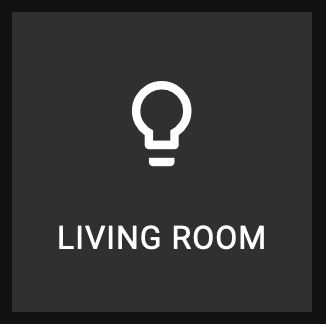
Switch
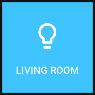
export default class extends HTMLElement {
  render() {
    const state = this.state['hass.light#switch.state'];
    const scale = Math.min(this.size.width, this.size.height);

    return `
      <style>
        :host {
          --scale: ${scale};

          align-items: center;
          background: ${state ? 'var(--color-active)' : 'transparent'};
          display: flex;
          flex-direction: column;
          font-size: calc(1rem * var(--scale));
          justify-content: space-evenly;
          padding: 12px;
          text-align: center;
        }

        .label {
          text-transform: uppercase;
        }

        .icon {
          font-size: 3.2em;
        }
      </style>

      <span class="icon mdi mdi-lightbulb-outline"></span>
      <span class="label">Living Room</span>
    `;
  }

  onAction() {
    const currentState = this.state['hass.light#switch.state'];

    // toggle
    this.state['hass.light#switch.state'] = !currentState;
  }

  static get styles() {
    return [
      'https://cdn.materialdesignicons.com/5.4.55/css/materialdesignicons.min.css',
    ];
  }
}