Weather Forecast : Sizing not consistent?

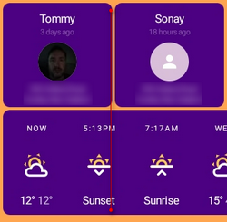
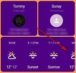
The updates to the Weather Forecast widget mean the sizing is no longer consistent with the other widgets. In my screenshot below I’m thinking things would look more uniform if things in the widget we are little more compact so 2 elements would fit into the grid to match the presence widget above… Does that make sense???

image

Generally, 2 forecast elements would not fit in a single cell space, because of text variation it needs more width than half a cell. Previously it would show 3 forecast elements when widget was 2-cell width (or 5 elements in 3-cell width), and each element would actually take more space comparing to right now.

Okay, I just picked it up when I did this… It just felt “non standard” and not fitting into the grid framework like other widgets.
But up to you, maybe the screenshot below helps to imply the new scrollable feature…

image

Yes, the partial visibility on the last element has that intent (it is not always half-visible, depending density, size, or grouping).
I will see if there is a better general sizing, or maybe there could be an option to make sparse/dense/aligned.