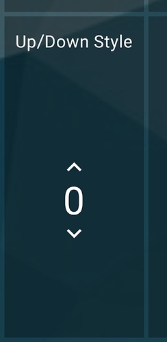
When you make a dimmer widget use the Up/down style, and make the widget span multiple spaces (i.e. 1x2) the up and down buttons do not spread out. It would be really nice to have a clear up ‘button’ and down ‘button’ above and below the level, making better use of the space and making it more finger friendly…
I’m nothing if not an ungrateful pain in the…
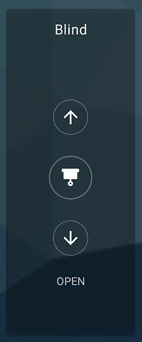
Thanks, this looks better. Any chance of larger icons or some other ui tweak for the blinds too…
wow, this looks great. It should also look like this for the dimmer switch (the arrows)
This topic was automatically closed 30 days after the last reply. New replies are no longer allowed.

