Room switches not displayed correctly with title, when extra row added

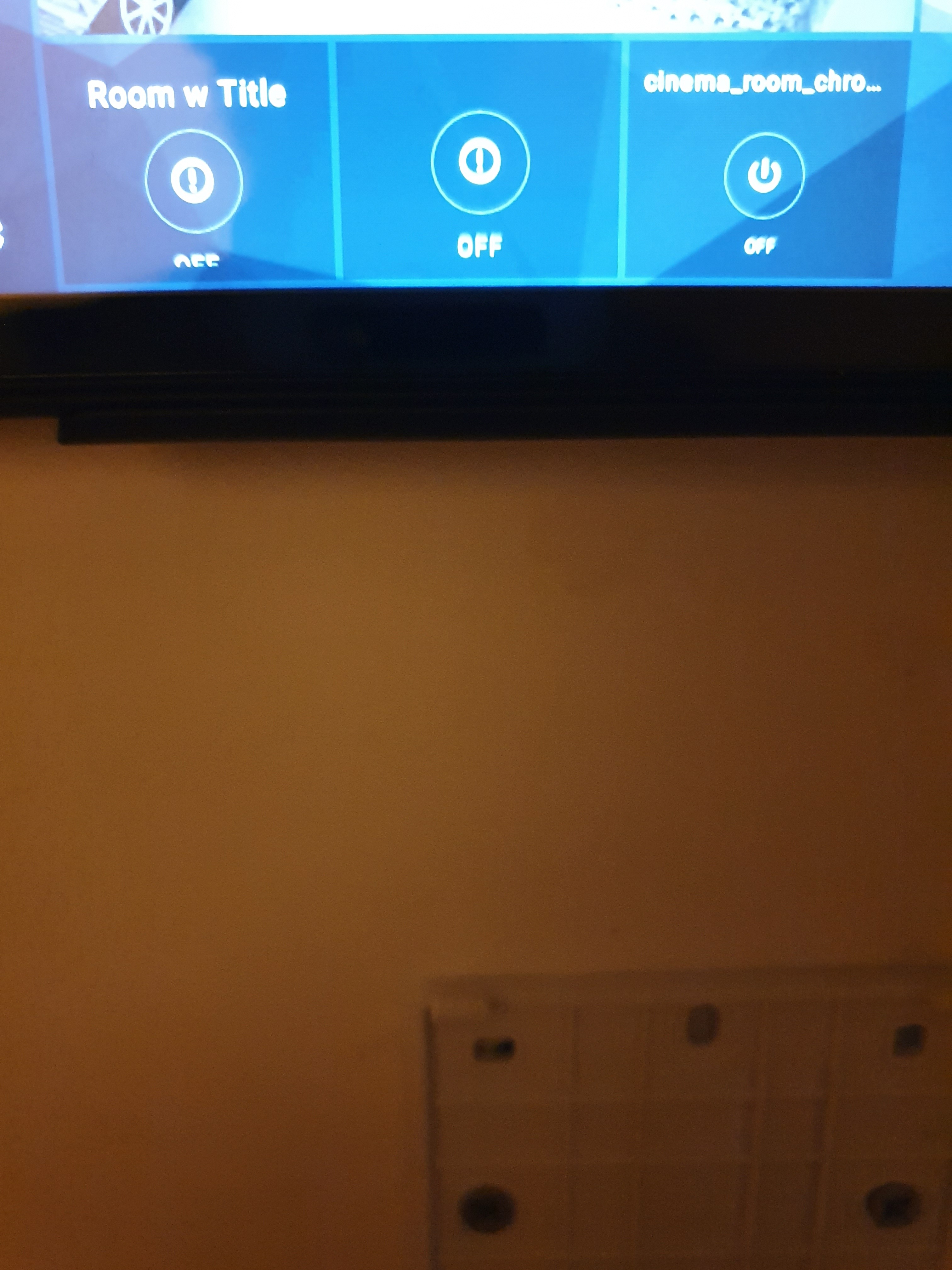
When I added an extra row to Fire HD 8 {5 high instead of 4), and used a room widget to nicely group some switches together, the layout isn’t quite right and Off gets cut off.

I did a quick test, and as you can see, a switch is fine, and a room with no title is fine (and no background camera), but a room with a title sees the switches Off text get cut off.

Generally, the app tries to do its best to adjust to widget size for different screen sizes and various rows/columns. However, it works best when widgets are as close to square size as possible.
It looks like this size has height a bit too short, which might affect the layout.

There are things to be improved in that area, so some widgets might have more layout issues than others in non-square size, but it is a tricky area to make changes.

Thanks for the reply.
It just seems strange that the other options get rendered correctly. I tried making things squarer with extra 2 extra columns but then things get too small and I lose the text all together.

I guess I will have to use separate switches for now, which won’t look as nice as I cant have a single collective title above all the buttons in a single widget (they are Harmony activities in a single room)

Let me know if there is any more I can do to help with this, or testing HH generally. Just ordered 2 more Fire HD 8s and docks for wall mounting, so going all in on HA and HomeHabit.