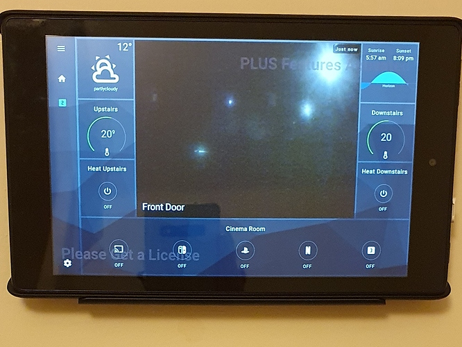
As I’m testing this on a mobile phone. The screen on this is small an “neat”.
It would be a nice feature to enable a “hide the homehabit menubar”, or a possibility to reduce it to only the hamburger menu.
As the screen is a lot smaller than on a tablet, it gives a little bit more space on the screen, and (for the OCD part of my brain) the aesthetic part. Better symmetry to the display. 
I know the app is designed for tablets, but at least here is “my two cents” on the topic.
