
To be honest I preferred the layout of the cover art in the legacy Media widget. Maybe an option could be added to switch between making the cover art prominent like in the legacy version or how it looks in the current Beta11…
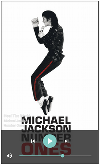
Legacy Version : Pity that MJ was always one of the “go to” for cover art examples…
Beta11 Version
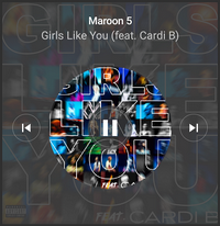
I must admit that the Artist and Track was not very readable on the legacy version… But in Beta11 it would just be nice to have a layout that emphasises the cover art. At them moment most of the cover art is hidden behind the semi-transparent colour.