
I know a lot of people have asked for charts… I understand the difficulties of getting historical values out of Home Assistant etc…
But maybe this suggestion could be one way to get some progress on this.
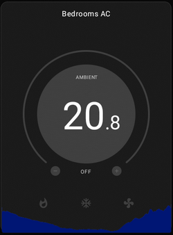
I propose a way to indicate a sensor (temperature) that I want to show at the bottom of my widget (thermostat) and then have some option as to how often to store the value and for how long to show/keep history.
Then HomeHabit stores these values and shows a small chart something like this…
I understand that metrics will only be stored while HomeHabit is running etc etc…
Thoughts?